
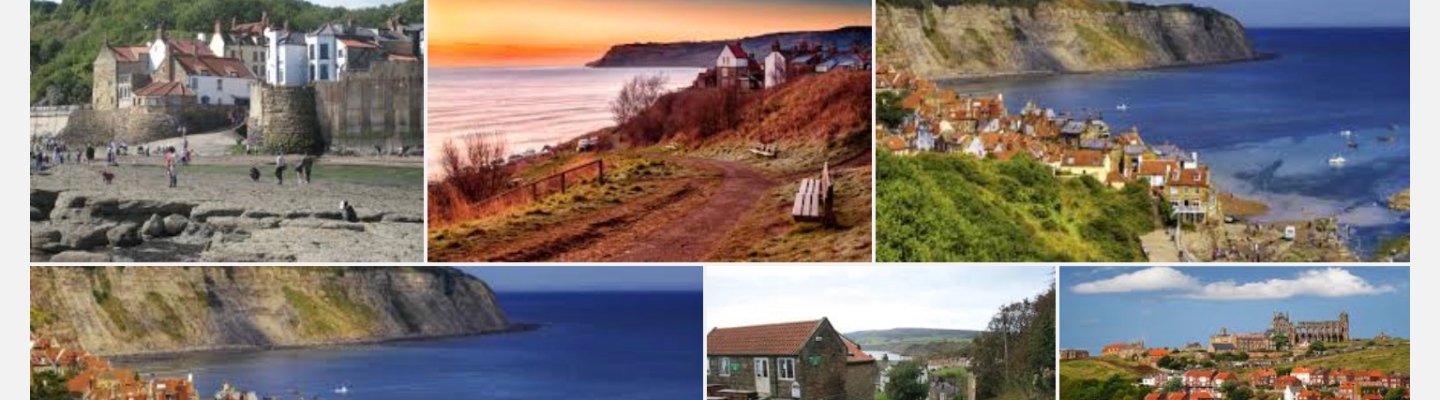


This Google search produced the above images. I noted down what I Saw in my notepad and then filtered them down to 10 things I saw in the photos. Then I looked at what must be in my shots to give the same effect but in a different way. Leaving the following. (Green must be in the shot. Red use the opposite).
All these shots look like holiday adverts. Almost like the empty roads in car marketing. I wanted to show the place in a great way but not by showing Blue sky.
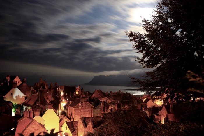
John Davies used traditional elements with contemporary industrial landscapes in his work. (1). I wanted to use a juxtaposition to say there is more to this place than the beach. It has mystery and secret places. Business was done in the dark in the past.

Using this as a template I produced this series of photographs.


The Image I chose for this Exercise shows the place in a new light whilst keeping some of the components of the expected images.
The photo was taken using a tripod with long exposure. F5.6, ISO100 15 sec exposure. Lens 40mm prime.
References
(1). Davies, J. (2016). John Davies Shizuoka Prefecture text. [online] Johndavies.uk.com. Available at: http://www.johndavies.uk.com/fuji text.htm [Accessed 23 Aug. 2016].

Three great images, Michael. For me, the first one is the most telling, with all its blues and mystery An unusual view of the place. It does need the horizon straightened though.
LikeLike
Thanks Holly interesting how different shots appeal to different people. Thanks for horizon spot. Now corrected. I pad too sensitive I think.
LikeLiked by 1 person